Searching Signals in the Air
Background
Reading the title and the About page, you may think I am writing about a signal sniffer of some sorts. That is an excellent topic but too ambitious for me to tackle as of now. Instead I want to share how to build a specialized pattern recognizer for weather data using Discrete Fourier Transform (DFT), run it on a Kubernetes cluster and learn more about how weather phenomena occur. While doing this, I also share the background of this numerical analysis technique.
The first recorded application of looking for patterns in seemingly complex set of occurrences may be credited with Pythagoras. Work on music theory attributed to him has influenced the definition of consonant and dissonant tones for multiple millenia. He recorded the lengths of lyre string combinations that create sounds humans (at least those who were living on the island of Samos around 540 BC) finding pleasurable. 600 years later Ptolemy extended (and refuted) Pythagoras’ earlier work as well as looked for patterns in the movements of celestial bodies. His work influenced Kepler in 1619 to write Harmony of the Worlds where he articulated on the periods of planetary rotation and their musical representation (where he lost the plot).
Following the formulation of calculus by Newton and Leibniz, things got much better. Especially thanks to the competition between Clairaut, Euler and d’Alembert on finding the best explanation of the Lunar Motion, a formulation close to Discrete Cosine Transform (DCT) was revealed. If you are really curious, you can check out some of the pages of Clairaut’s prize winning essay in the National Library of France. Both my French and the ability to interpret Clairaut’s writing are pretty limited but he formulated it as such (paraphrased since he didn’t use the summation):
where : observed Earth-Moon distance, : mean Earth-Moon distance. All the harmonics, perturbations observed due to the three-body problem are what is included in those cosine terms.
Few years later in mid 1760s Lagrange did the same thing using a sine only series which is similar to in formulation to Discrete Sine Transform. Lagrange’s essay is significantly easier to read. Reading all this work, especially Lagrange’s material during his Gottingen University years, Gauss came up with the algorithm what is commonly known as Fast Fourier Transform (FFT) to explain the trajectory of asteroid Juno which was discovered in 1804. Amazingly, Gauss decided not to publish the algorithm and moved on with other work. It took another century and a half for two IBM researchers Cooley and Tukey to publish their work where they showed the amplitudes of the cosine and sine series to define any function can be calculated in time instead of . A very readable article, History of Gauss’ Role in FFT is a great source to explain all of this historical perspective. If you are wondering why it is called Fourier transform but not Gauss transform, read the conclusion of that article.
Going back to the original premise of this blog, i.e., searching for a signal in a set of observations, I decided to follow the recipe of a summation of cosine series. As for the set of observations, I chose to use what I called magic Oppermann (mO) numbers in the Prime Jobs. [By the way, I also noticed that OEIS series A192391 is identical to the set of magic Oppermann numbers with the exception of starting with 1.] When I did the plot for the entire set of mO numbers the result was not very interesting. However, doing the same for using only the prime mO numbers resulted in the following graph.
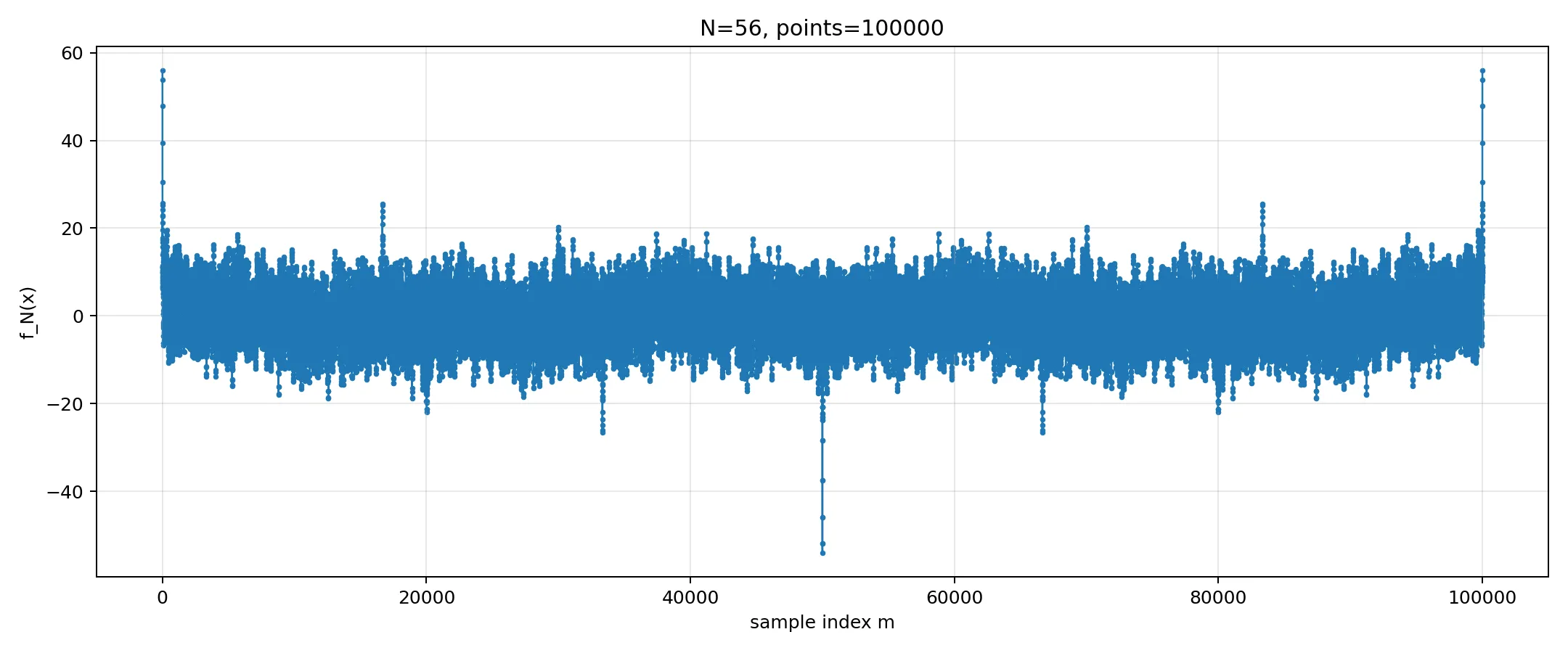
What this graph shows is if you take the first 56 prime mO numbers (happened to be those less than 10000), generate the function and sample the function 100000 times between 0 and , you would get the plot above. There is nothing special about 56 numbers. You can take smaller or larger set of numbers. If you have very few numbers in the set, you will see the sinusoids as opposed to the peaks. If you have a very large set of numbers, the plot generation time would be significantly longer and as long as the set follows the same pattern, you will see the same patterns of peaks. The number of samples is related to the largest number in the set. Looking at the formula for the function, you see that the highest frequency component is generated by the largest prime mO number included and it happens to be 9871. As long as you sample twice the highest frequency you are in good shape. If you are curious, search for Nyquist-Shannon sampling theorem.
The plot shows us few interesting things identical to those included in the recipe of a summation of cosine series:
- is symmetric around because . This is a generic characteristic of the cosine plot, regardless of the integer set.
- because . Similarly this is a generic feature.
- For our first 56 prime mO numbers, the next interesting characteristic is the negative peak at . Since is -1 for every except , . This is true for any set of prime numbers.
- Another major negative peak is at . Since for all mO numbers except , . Similarly, this is true for any set of prime numbers.
- A large positive peak is at . Since all except and , . Once again, this is a feature of any set of prime numbers.
There are some frequency patterns such as a noticeably smaller percentage of prime mO numbers ending with digit 1 (in base 10), and that percentage difference being way bigger than the Chebyshev’s Bias. However, my data set is too small to make any meaningful conjectures.
Focus of Learning
Once I got the mO number analysis completed, I thought about how to do something similar with a significantly larger data set and use it in a Kubernetes environment.
Humans have been observing, recording, forecasting weather for tens of thousands of years. That is why there is a lot of historical weather data to tap into. Weather data is cyclic in terms of days and years, apart from the longer-term trends that we all have been experiencing since the late 1930s according to the US government climate watchers. Anyway, I decided to take advantage of this abundance and try out the cosine summation technique on any available weather data set I could find. Open Meteo is an excellent source of such data and it allows accessing weather data without any API key as long as you are not doing this to make money or to abuse their excellent service.
I continue to use Kubernetes as the distributed system choice of implementation. In this case, the components to analyze the signal in weather data are:
weather-dbDeployment that usesweather-spectrum-pvcto retain both the source data, and the analysis results. I used a Deployment instead of a StatefulSet with a generic solution such as Postgres to simplify the implementation. Using FastAPI and using an application specific database as opposed to a generic one were deliberate design choices to simplify.weather-apiDeployment that usesweather-dbservice to access the analysis results as well as expose a web interface to users. It uses FastAPI to allow extensibility by providing access to external clients without direct access to theweather-db.weather-fetchJob that obtains weather data from the Open Meteo API for the configurable set of cities around the world and populates theweather-db.weather-analyzeJob that performs the cosine sum analysis for the weather data and updates theweather-dbwith analysis results.weather-reduceJob that summarizes theweather-analyzeresults per location into a sortable, global set of data for visual representation.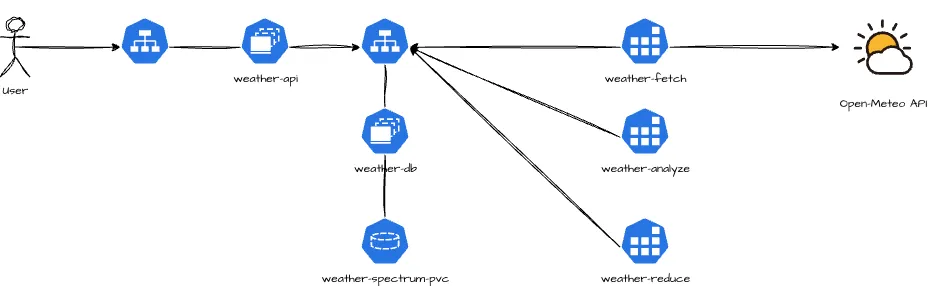
Implementation Details
In order to follow the rest of the blog, please check the GitHub repository blog-signal-searching.
Create a Container Image for Weather Components
This container image is implemented in Python using FastAPI, numpy, matplotlib, sqlite3 with the help of ChatGPT-5.4. Follow the instructions in the README file for the GitHub repository weather-spectrum to build and store the image. This image includes all the scripts for weather-db, weather-api Deployments and the three Jobs for source data fetch, analysis and summarization.
Deployment of the Kubernetes Resources
Assuming you happen to have access to a Kubernetes cluster, follow the instructions
of the GitHub repo blog-signal-searching to simplify the generation of resource files. I’d
recommend you use the demo deployment option using kustomize.
What I Learned
There is a noticeable difference between temperature and surface pressure in terms of period. In all climates around the world, across continents, with varying altitude, a 24-hour period for temperature changes is easy to observe. The Sun rises, temperature goes up, the Sun goes down and temperature follows. Some of the coastal cities with less solar exposure such as Copenhagen, Montevideo, Reykjavik or Wellington, this effect is a bit weaker but still observable.
On the other hand, the surface pressure analysis is very different. There are two forces that impacts the surface pressure according to NSF National Center for Atmospheric Research:
- The semidiurnal (12-hour period) oscillation that is primarily due to solar heating through the ozone layer.
- The diurnal (24-hour period) oscillation that is due to heating from the water vapor and heating from the land masses.
The article I quoted explains that the diurnal pressure oscillation is comparable to the semidiurnal pressure oscillation in magnitude over much of the globe except for the low-latitude open oceans. Over many land areas, including western United States, the Tibetan Plateau, and eastern Africa, the diurnal pressure oscillation is even stronger than the semidiurnal one. Authors of the article consider this to be in contrast to the conventional notion that semidiurnal oscillation predominates over much of the globe.
I include few example city plots for the 365-day period between March 21st, 2025 and March 21st, 2026 from the web interface of the weather-spectrum analyzer.
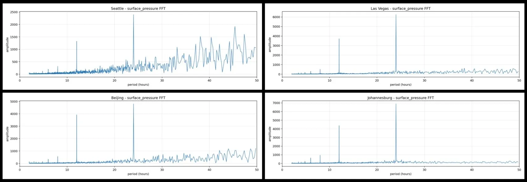 Frequency plot for cities with low semi-diurnal/diurnal period ratio for surface pressure.
A sizable number of cities out of 100 that I chose show significant diurnal periodicity for the surface pressure change. As the paper mentioned Western US cities such as Seattle or Las Vegas, Beijing which is at the end of the Tibetan Plateau or Johannesburg in Eastern Africa all exhibit significant surface air pressure peaks for the 24-hour period. However, even for these cities as well as all others the 12-hour peak on the frequency plot is easily visible.
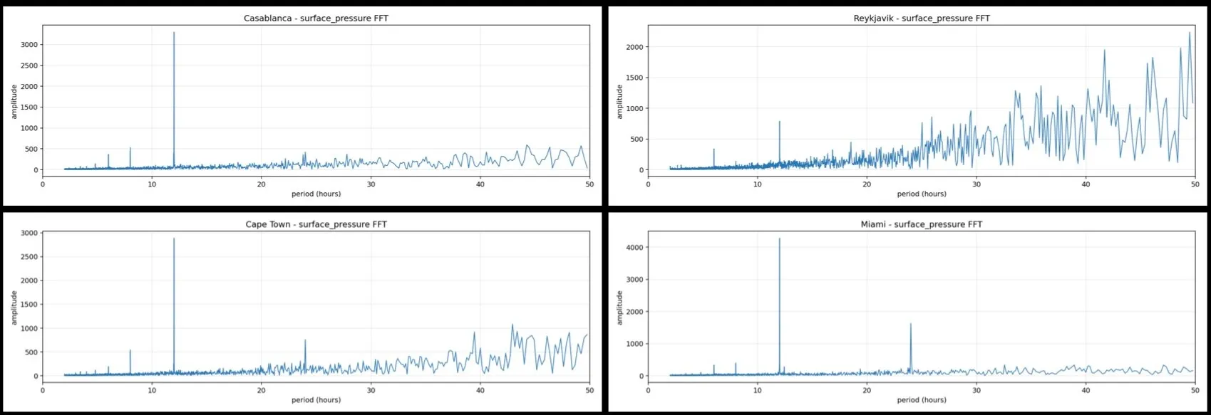 Frequency plot for cities with high semi-diurnal/diurnal period ratio for surface pressure.
The majority of the 100 cities exhibit significant surface air pressure peaks for the 12-hour period. In cities such as Casablanca, Miami or Cape Town, the only meaningful air-pressure period is the effect of solar heating through the ozone layer. Reykjavik is an interesting example where even though the semi-diurnal period is noticeable, there are many other factors such as strong winds due to jet streams impacting the air-pressure with longer periods.
If you are curious, play with the tool where you will find out that many other Northern latitude cities in Europe as well as in North America such as Toronto and Chicago have a profile similar to Reykjavik.
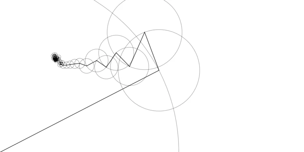
Blog’s lead image was generated using the inspirational material from Grant Sanderson 3Blue1Brown article on Fourier transform animation.